
Power BI, Excel & SQL · Beginner · 75 minutes
Introduction to Symmetry Plot, Variability Chart and Multi-Vari Chart in Minitab
Learn what each chart answers, build it in Minitab, and explain the result using a fictitious steel-pipe manufacturing case.
All teaching data are fictitious. The screenshots are actual Minitab output supplied for this lesson. Each chart below is the original supplied Minitab screenshot, embedded unchanged with its interpretation.
Your learning route
By the end, you can
- Choose a chart for distribution shape, consistency, or factor effects.
- Import the practice workbook and assign responses and factors correctly.
- Create all three charts using clear Minitab menu paths.
- Read symmetry, cell ranges, sample standard deviations, and interactions.
- Write an evidence-based investigation recommendation.
What you need: Minitab Statistical Software with these Quality Tools available. The instructions use the current English Minitab help labels. Your version may arrange the dialog differently. A spreadsheet application is useful for the optional Excel checks. You can complete the browser activities without Minitab.
How to study: read the explanation, make a prediction in the practice activity, follow the Minitab steps, then open Review Minitab output to compare your result. Keep the dropdown closed until you have tried the chart.
1 · Ask the right question
Three charts, three different questions
A process specialist is investigating wall-thickness differences between two pipe lines. Before fitting a model, they want to understand the distribution of measurements, the consistency of each operating group, and whether the shift effect changes between lines. These charts help answer those questions visually.
| Chart | Question it answers | Inputs | Typical use case |
|---|---|---|---|
| Symmetry plot | Is a distribution balanced around its median? | One numeric variable, such as thickness or downtime. | Explore skewness before choosing summaries or an analysis approach. |
| Variability chart | Which factor combinations have different averages and different within-group spread? | A numeric response and grouping factors, with repeated observations per cell. | Find the line/shift/position combinations that are least consistent. |
| Multi-vari chart | How do factor-level means differ, and does one factor's effect depend on another? | A numeric response and two or more meaningful factor levels. | Look for position effects and Line × Shift interactions before ANOVA or regression. |
Try it: choose a chart
Start with a symmetry plot of downtime to inspect the balance of the tails around the median.
2 · Prepare your worksheet
Download and import the practice data
The workbook contains the same values used by the supplied Minitab screenshots. The two analysis sheets serve different purposes. Do not combine them into a single analysis.
| Sheet | Contents | Use |
|---|---|---|
| Guide | Chart instructions and interpretation notes. | Read alongside this lesson; do not import for analysis. |
| Symmetry_Data | 30 wall readings and 30 independent downtime observations. | Make two symmetry plots. |
| Factor_Data | 60 distinct pipes across 12 factor combinations. | Make the variability and multi-vari charts. |
| Data Dictionary | Column definitions, units, and sampling design. | Read before interpreting the measurements; do not import for analysis. |
Step by step: open the Excel workbook in Minitab
- Save the download. Choose the workbook link above and save the file somewhere you can find it.
- Open it in Minitab. Choose
File → Open, selectminitab-chart-practice.xlsx, and click Open. If the file is not shown, select an Excel-compatible file type in the file dialog. - Select the sheets to import. In the Open Excel File dialog, inspect each sheet's tab. Leave Import this sheet selected for
Symmetry_DataandFactor_Data. Clear it forGuideandData Dictionary. - Import the column names. Set First row to import to 1 and select Data has column names for each data sheet. Confirm the import.
- Check the worksheets.
Symmetry_Datashould have 30 rows and columnsObs,Wall_mm,Downtime_min.Factor_Datashould have 60 rows and columnsPipe_ID,Line,Shift,Position,Wall_mm. - Check the types.
Wall_mmandDowntime_minmust be numeric.Line,Shift, andPositionare categorical text. If measurements imported as text, correct the import/decimal settings before plotting. Save a Minitab project if you want to keep your graphs.
CSV alternative: open each CSV using File → Open, check the comma delimiter and that the first row supplies column names, and keep the files in separate worksheets. The CSV downloads contain analysis data only.
Understand what one row means
In Symmetry_Data, the wall-thickness sample and downtime sample are independent datasets. Their placement on the same row does not pair a pipe with a stoppage. Obs is just a row identifier.
In Factor_Data, each row is one measurement from one distinct pipe at its assigned Leading, Middle, or Trailing location. A pipe is measured only once in this example. The data are not repeated measurements of the same pipe at three locations. This distinction matters if you later select an inferential model.
Wall_mm is the numeric response. Line, Shift, and Position are factors. A/B, Day/Night, and Leading/Middle/Trailing are their levels. A cell is one complete combination, such as B / Night / Leading. There are 2 × 2 × 3 = 12 cells, with 5 different pipes per cell, so there are 60 measurements. Every combination is represented.Preview the practice data
These tables show every analysis row. Download the workbook to practice in Minitab.
| Obs | Wall_mm | Downtime_min |
|---|---|---|
| 1 | 9.535 | 3 |
| 2 | 9.525 | 7 |
| 3 | 9.540 | 11 |
| 4 | 9.520 | 24 |
| 5 | 9.545 | 140 |
| 6 | 9.515 | 6 |
| 7 | 9.550 | 10 |
| 8 | 9.510 | 17 |
| 9 | 9.555 | 80 |
| 10 | 9.505 | 5 |
| 11 | 9.560 | 9 |
| 12 | 9.500 | 14 |
| 13 | 9.570 | 48 |
| 14 | 9.490 | 4 |
| 15 | 9.580 | 8 |
| 16 | 9.480 | 12 |
| 17 | 9.590 | 30 |
| 18 | 9.470 | 190 |
| 19 | 9.600 | 7 |
| 20 | 9.460 | 10 |
| 21 | 9.615 | 20 |
| 22 | 9.445 | 105 |
| 23 | 9.630 | 6 |
| 24 | 9.430 | 9 |
| 25 | 9.650 | 15 |
| 26 | 9.410 | 62 |
| 27 | 9.680 | 5 |
| 28 | 9.380 | 8 |
| 29 | 9.720 | 13 |
| 30 | 9.340 | 38 |
| Pipe_ID | Line | Shift | Position | Wall_mm |
|---|---|---|---|---|
| P001 | A | Day | Leading | 9.470 |
| P002 | A | Day | Leading | 9.480 |
| P003 | A | Day | Leading | 9.490 |
| P004 | A | Day | Leading | 9.500 |
| P005 | A | Day | Leading | 9.510 |
| P006 | A | Day | Middle | 9.510 |
| P007 | A | Day | Middle | 9.520 |
| P008 | A | Day | Middle | 9.530 |
| P009 | A | Day | Middle | 9.540 |
| P010 | A | Day | Middle | 9.550 |
| P011 | A | Day | Trailing | 9.550 |
| P012 | A | Day | Trailing | 9.560 |
| P013 | A | Day | Trailing | 9.570 |
| P014 | A | Day | Trailing | 9.580 |
| P015 | A | Day | Trailing | 9.590 |
| P016 | A | Night | Leading | 9.480 |
| P017 | A | Night | Leading | 9.490 |
| P018 | A | Night | Leading | 9.500 |
| P019 | A | Night | Leading | 9.510 |
| P020 | A | Night | Leading | 9.520 |
| P021 | A | Night | Middle | 9.520 |
| P022 | A | Night | Middle | 9.530 |
| P023 | A | Night | Middle | 9.540 |
| P024 | A | Night | Middle | 9.550 |
| P025 | A | Night | Middle | 9.560 |
| P026 | A | Night | Trailing | 9.560 |
| P027 | A | Night | Trailing | 9.570 |
| P028 | A | Night | Trailing | 9.580 |
| P029 | A | Night | Trailing | 9.590 |
| P030 | A | Night | Trailing | 9.600 |
| P031 | B | Day | Leading | 9.480 |
| P032 | B | Day | Leading | 9.500 |
| P033 | B | Day | Leading | 9.520 |
| P034 | B | Day | Leading | 9.540 |
| P035 | B | Day | Leading | 9.560 |
| P036 | B | Day | Middle | 9.520 |
| P037 | B | Day | Middle | 9.540 |
| P038 | B | Day | Middle | 9.560 |
| P039 | B | Day | Middle | 9.580 |
| P040 | B | Day | Middle | 9.600 |
| P041 | B | Day | Trailing | 9.560 |
| P042 | B | Day | Trailing | 9.580 |
| P043 | B | Day | Trailing | 9.600 |
| P044 | B | Day | Trailing | 9.620 |
| P045 | B | Day | Trailing | 9.640 |
| P046 | B | Night | Leading | 9.600 |
| P047 | B | Night | Leading | 9.640 |
| P048 | B | Night | Leading | 9.680 |
| P049 | B | Night | Leading | 9.720 |
| P050 | B | Night | Leading | 9.760 |
| P051 | B | Night | Middle | 9.640 |
| P052 | B | Night | Middle | 9.680 |
| P053 | B | Night | Middle | 9.720 |
| P054 | B | Night | Middle | 9.760 |
| P055 | B | Night | Middle | 9.800 |
| P056 | B | Night | Trailing | 9.680 |
| P057 | B | Night | Trailing | 9.720 |
| P058 | B | Night | Trailing | 9.760 |
| P059 | B | Night | Trailing | 9.800 |
| P060 | B | Night | Trailing | 9.840 |
3 · Distribution shape
Symmetry plot: are the two tails balanced?
A symmetry plot compares observations above and below the median. Imagine folding a distribution at its median: values at corresponding distances on the two sides should line up if the distribution is symmetric. A few long stoppages can stretch the right tail even when most stoppages are short.
Use it for: exploring wall-thickness distributions, cycle times, waiting times, repair durations, or other numeric measurements. It helps you see skewness that a single mean can hide. Examine a histogram as well to see features such as multiple peaks.
How the plot is constructed
- Sort the observations and find the median.
- Pair the closest observation below the median with the closest above it. Continue outward through the tails.
- Plot the upper observation's distance above the median on the horizontal axis, and the lower observation's distance below the median on the vertical axis.
- Compare the plotted points with the diagonal equality line.
Here, m is the sample median. The diagonal represents equal distances on the two sides.
| Point pattern | Meaning | Why |
|---|---|---|
| Near the diagonal | Approximately symmetric. | Above-median and below-median distances are similar. |
| Diverges below the diagonal | Right-skewed. | The upper tail extends farther: horizontal distance is larger. |
| Diverges above the diagonal | Left-skewed. | The lower tail extends farther: vertical distance is larger. |
Worked example: the wall median is 9.530 mm. The extreme pair is 9.340 and 9.720 mm, so both distances are 0.190 mm and the point lies on the diagonal. The downtime median is 11.5 min. Its extreme pair is 3 and 190 min: the horizontal distance is 178.5 min and the vertical distance is 8.5 min. That point lies far below the diagonal, showing a long right tail.
Predict before reviewing: which tail is longer?
For downtime, the extreme pair is 3 and 190 min and the median is 11.5 min. The distance above the median is 178.5 min; the distance below is 8.5 min. Where should this pair appear relative to the diagonal?
Follow the Minitab steps below, then open Review Minitab output to compare your reasoning with the original output and explanation.
Step by step: create a symmetry plot in Minitab
- Activate
Symmetry_Data. Click that worksheet's tab. VerifyWall_mmandDowntime_minare numeric. - Open the command. Choose
Stat → Quality Tools → Symmetry Plot. - Select the variable. Click Variables and choose
Wall_mmfrom the column list. Do not selectObs. - Create the graph. Click OK. Read the distance axes and diagonal, then compare the inset histogram.
- Repeat for downtime. Reopen the same command, replace the variable with
Downtime_min, and click OK. - Write the interpretation. State whether each sample is symmetric or skewed, identify the tail direction, and describe the evidence. Now open the output dropdowns below.
Review Minitab output
Wall thickness: symmetric around 9.530 mm
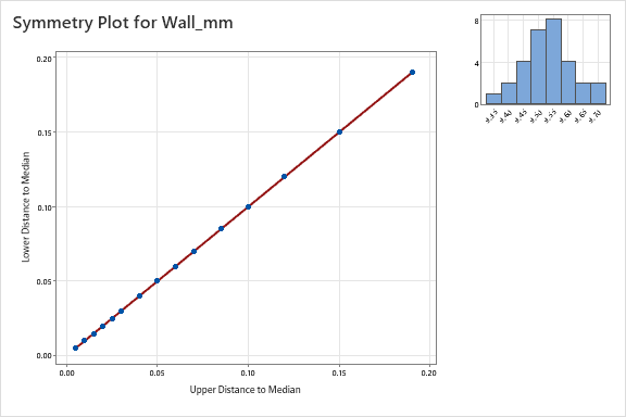
- Read the axes. The horizontal axis is distance above the median, and the vertical axis is distance below it.
- Compare with the diagonal. The points lie on the diagonal because the fictitious sample was constructed with matching distances on both sides of 9.530 mm.
- Check the histogram. Its two sides balance around the center.
- Report the result. “The wall-thickness sample is symmetric around its median of 9.530 mm.” This is a distribution observation. It does not prove normality, stability, or capability against specifications.
Review Minitab output
Downtime: a long right tail
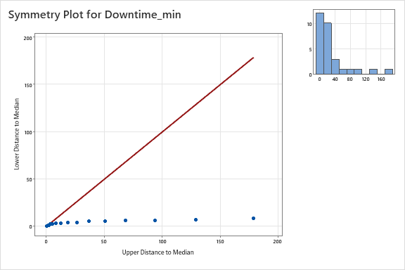
- Compare the tail distances. Farther from the median, horizontal distances become much larger than vertical distances.
- Identify the direction. The points diverge below the diagonal, so the sample is right-skewed.
- Use the histogram. Most stoppages are short, while a few last much longer. The maximum is 190 min compared with a median of 11.5 min.
- Report the result. “Downtime has a long right tail. Investigate the long-duration stoppages separately and use a median alongside the mean when describing typical duration.” Do not select or transform a model solely from this graph.
4 · Consistency within groups
Variability chart: compare averages and spread
A variability chart groups individual measurements by factor levels so you can compare their means and their within-cell variation. Two groups can have the same average and very different consistency. Conversely, their averages can differ while their spreads remain similar.
Use it for: comparing machines, lines, operators, shifts, suppliers, batches, or positions. In this example, the question is: “Which Line / Shift / Position combinations produce the greatest variation in wall thickness?”
Read the parts of the chart
- Individual points show the actual wall readings.
- Cell mean shows the average for one complete factor combination.
- Range bar joins that cell's observed minimum and maximum. A longer bar indicates more spread. It is not a confidence interval or a control limit.
- Connecting lines of cell means make changes in average response easier to follow.
- Overall mean is an optional horizontal reference line. It does not represent a specification or target.
- Standard deviation chart is an optional second graph comparing sample SDs within the cells. Five pipes per cell make SD estimation possible here.
Calculate the range and sample SD separately for each cell. A mean uses the five measurements in that cell.
Why include Position? Leading, Middle, and Trailing means intentionally differ. If you group only by Line and Shift, the spread of the 15 readings mixes those position differences with the scatter of pipes measured at the same position. Including Position isolates the five-pipe comparison within each location.
Practice: distinguish the mean from the spread
Imagine adding 0.100 mm to each of the five measurements in one cell. Before looking at the output, decide what happens to that cell’s mean, range and sample standard deviation.
Follow the Minitab steps below, then open Review Minitab output to compare your reasoning with the original output and explanation.
Step by step: create a variability chart in Minitab
- Activate
Factor_Data. Check that all 60 rows are present. - Open the command. Choose
Stat → Quality Tools → Variability Chart. - Assign the response. In Responses, enter
Wall_mm. - Assign the factors in order. In Factors (1–8, outermost first), enter
Line, thenShift, thenPosition. This places positions within shifts within lines. Leave By variables blank. Do not usePipe_IDas a factor. - Choose the display. Click Options. Select Individual data points, Range per cell, Connecting lines of cell means, and Overall mean to reproduce the supplied average-response screenshot. Also select Standard deviation chart and Mean of standard deviations to reproduce the second supplied output and its horizontal reference line.
- Create the charts. Click OK to close Options, then OK in the main dialog.
- Compare means and spread separately. Identify which cells have high means and which have long ranges. Use the SD chart to compare within-cell variability. Open the output dropdown below to check your findings.
Review Minitab output
B / Night has a higher mean and greater spread
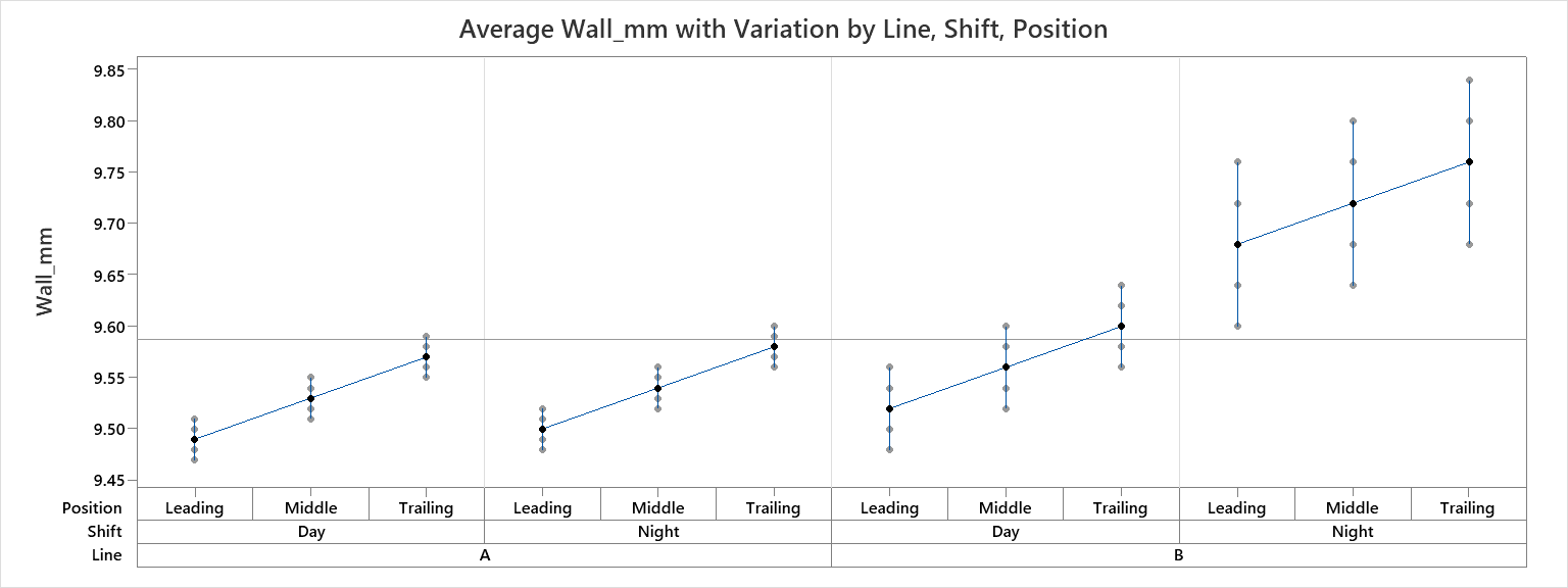
- Read the grouping. Leading, Middle, and Trailing appear within Day and Night, grouped under Lines A and B.
- Find the overall mean. The horizontal reference is 9.5875 mm across all 60 readings. It is a sample mean, not a target or limit.
- Compare cell ranges. A / Day and A / Night ranges are 0.040 mm. B / Day ranges are 0.080 mm. B / Night ranges are 0.160 mm at each position.
- Compare averages. The 15-reading Line / Shift means are 9.530, 9.540, 9.560, and 9.720 mm respectively. B / Night stands out in both location and spread.
- Compare with the SD output below. Its values are approximately 0.01581 mm for each A cell, 0.03162 mm for each B / Day cell, and 0.06325 mm for each B / Night cell. These are within-position SDs, not SDs of all 15 readings pooled across positions.
- Recommend an investigation. “Prioritize B / Night because it has both a higher average thickness and greater within-position variation. Review setup, measurement-system performance, and relevant operating conditions.” The chart alone does not identify a cause or show out-of-specification product.
Standard deviation: compare consistency within each cell
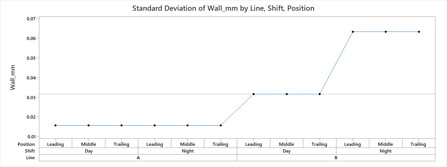
What this output adds: the first graph shows cell averages and individual readings. This second graph isolates the spread of the five measurements within each Line / Shift / Position cell. A higher point means greater within-cell variation.
- Read the horizontal grouping. Start at Line A, compare Day and Night, and within each shift read Leading, Middle and Trailing. Repeat for Line B. There are twelve points, one for each cell, with five different pipes behind each point.
- Read the vertical scale. Although the axis label is
Wall_mm, the chart title identifies the plotted statistic as standard deviation in millimetres. A point at 0.06325 is an SD, not an average wall thickness of 0.06325 mm. - Compare the three plateaus. All six A cells have SD approximately 0.01581 mm. The three B / Day cells have SD approximately 0.03162 mm. The three B / Night cells have SD approximately 0.06325 mm. B / Night's SD is twice B / Day's and four times A's. These comparisons concern SD, not variance.
- Understand the horizontal line. At approximately 0.03162 mm, it is the arithmetic mean of the twelve cell SDs: (6 × 0.01581 + 3 × 0.03162 + 3 × 0.06325) ÷ 12, using rounded values. It is a comparison reference, not a control limit, specification limit, or the SD of all sixty readings pooled together.
- Separate position from consistency. Each Line / Shift group is flat across its three positions, so the constructed data have equal within-cell SDs across positions. The earlier mean chart still rises from Leading to Trailing. Means can change while the spread stays the same. The connecting line joins factor cells; it is not a time trend.
- Write the conclusion. “B / Night has the greatest within-cell variation at every measured position. Its SD is about 0.06325 mm, compared with 0.03162 mm on B / Day and 0.01581 mm on A. Investigate B / Night operating conditions and measurement consistency.” Five observations per cell give a limited estimate; this graph alone does not establish statistical significance, a cause, or process stability.
Check it yourself: in the original workbook, =STDEV.S(Factor_Data!E47:E51) gives 0.06324555 mm for B / Night / Leading. Compare that value with the first point on the highest plateau. Use the five readings from one cell, not all sixty readings.
5 · Factor effects and interactions
Multi-vari chart: does one factor change another's effect?
A multi-vari chart displays response means across combinations of categorical factors. It lets you compare effects at several levels in one view. In this case, compare positions within shifts and shifts within lines.
Use it for: exploring machine × operator, supplier × material, line × shift, or other factor relationships before a formal analysis. Its central value here is showing that the shift effect is different on Lines A and B.
How it differs from a variability chart
The variability chart emphasizes the observations and spread within each cell. The multi-vari chart emphasizes mean patterns across factors. It can display individual observations too, but the means-first view makes the factor structure easier to follow. Choose the one that answers your investigation question.
What an interaction means
An interaction occurs when the effect of one factor depends on the level of another. Here, changing Day to Night increases average wall thickness by 0.010 mm on Line A and 0.160 mm on Line B. The unequal changes suggest a Line × Shift interaction. Lines do not have to cross for an interaction to exist.
Position effect: Trailing-position means exceed Leading-position means by 0.080 mm in all four Line / Shift groups. That position effect is consistent across those groups in this deliberately constructed example.
Practice: compare the shift effects
Using the original data, Line A changes from 9.530 to 9.540 mm; Line B changes from 9.560 to 9.720 mm. What does this suggest about Line and Shift?
Follow the Minitab steps below, then open Review Minitab output to compare your reasoning with the original output and explanation.
| Line | Day mean (mm) | Night mean (mm) | Night − Day (mm) |
|---|---|---|---|
| A | 9.530 | 9.540 | 0.010 |
| B | 9.560 | 9.720 | 0.160 |
Step by step: create a multi-vari chart in Minitab
- Activate
Factor_Data. Use the original 60-row worksheet. - Open the command. Choose
Stat → Quality Tools → Multi-Vari Chart. - Assign the response. In Response, enter
Wall_mm. - Assign Factor 1. Select
Position. This is the innermost comparison. - Assign the remaining factors. Set Factor 2 to
Shiftand Factor 3 toLine. Leave Factor 4 blank. This order is the reverse of the outermost-first entry order used for the variability chart. - Choose the display. Click Options. Select Connect means for Factor 1, Connect means for Factor 2, and Connect means for Factor 3. For your first graph, leave Display individual data points unchecked so you can concentrate on the means.
- Create and read the graph. Click OK in Options and then OK in the main dialog. Read the legend, compare positions within each shift, then compare shifts within each line.
- Try the alternative view. Reopen the command with the same factor order and select Display individual data points. Compare how the added observations show scatter around the means. Changing factor order changes the viewing emphasis, not the measurements.
Data requirements: Minitab supports up to four factors for Multi-Vari Chart. Each factor needs at least two levels, and observations must populate at least 60% of all factor-level combinations. Our 12 of 12 cells provide 100% coverage. Good replication and a suitable sampling design are still needed for meaningful inference.
Review Minitab output
Read Position within Shift within Line
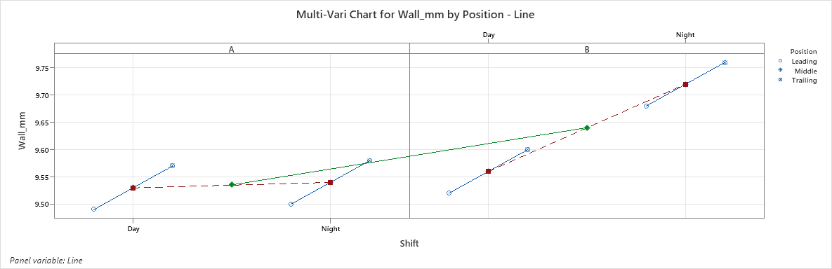
- Start with the legend. In this output, the blue Position markers represent cell means, red squares represent Shift means within each line, and green diamonds represent Line means. Use the labels as well as colors.
- Compare the blue Position means. Leading to Middle to Trailing increases by 0.040 mm at each step, or 0.080 mm from Leading to Trailing.
- Compare Day and Night within A. The shift means are 9.530 and 9.540 mm, a 0.010 mm increase.
- Compare Day and Night within B. The shift means are 9.560 and 9.720 mm, a 0.160 mm increase.
- Compare Line means carefully. A averages 9.535 mm and B averages 9.640 mm. Averaging all shifts together conceals the much larger Night effect on B.
- Report the interaction. “The effect of Shift depends on Line: the Night increase is much larger on B. Analyze the Line × Shift combination rather than treating Night as a uniform effect.” A suitable ANOVA or regression model can test and estimate the effect after design and assumption checks.
6 · Practice, check, explain
Complete the investigation
Use your Minitab graphs and the original dataset. Write your own interpretation before revealing each answer.
Quick calculation check
Calculate the B / Night / Leading range from its five measurements: 9.600, 9.640, 9.680, 9.720, and 9.760 mm.
Enter your result, then select Check my calculation.
- Explain the two symmetry plots. Which sample is symmetric and which has a long right tail?
Check the explanation
Wall_mm is symmetric around 9.530 mm because matching tail distances lie on the diagonal. Downtime_min is right-skewed: above-median distances exceed below-median distances, moving the points below the diagonal. - Separate the mean problem from the consistency problem. Why should B / Night receive attention?
Check the explanation
Its overall Line / Shift mean is 9.720 mm, and each position cell has a range of 0.160 mm and sample SD about 0.06325 mm. Both the average and the within-position spread stand out. Specifications are not included, so this alone does not show whether the product fails a specification. - Explain the interaction. Why would a single Day-to-Night average change be incomplete?
Check the explanation
The change is only 0.010 mm on A and 0.160 mm on B. The equally weighted pooled shift change is 0.085 mm, which hides these two different responses. Keep Line × Shift in the investigation. - Investigate the sampling structure. How would the analysis change if Leading, Middle, and Trailing readings came from the same pipe?
Check the explanation
Measurements on the same pipe would be related. Record a shared Pipe_ID and use an appropriate repeated-measures or mixed-effects design when doing inference. Do not count those related readings as independent pipes. The graphs can still be useful descriptively. - Write a short recommendation. Name the group, quote mean and spread evidence, identify checks, and state the next analysis.
Read a worked recommendation
“Prioritize Line B during Night. Its mean wall thickness is 9.720 mm and its within-position range is 0.160 mm, compared with 9.560 mm and 0.080 mm on B during Day. Check measurement-system performance, setup records, and operating conditions. Collect independent replicated data and use a model that includes Line × Shift, with assumption checks, to assess the pattern.”
If your Minitab graph looks different
| Problem | Check | Fix |
|---|---|---|
| A measurement column is unavailable. | Was it imported as text? | Correct the delimiter, decimal separator, and header import. Confirm the response is numeric. |
| The chart has too many groups. | Did you include Pipe_ID or Obs as a factor? | Use Line, Shift, and Position as the factors. IDs label observations. |
| The groups appear in a different order. | Factor order and value ordering. | For variability enter Line, Shift, Position; for multi-vari enter Position, Shift, Line. Follow the labels even if category order differs. |
| Your range seems too large. | Did you omit Position and pool 15 readings? | Use all three factors to compare the same five-pipe cells shown in the screenshot. |
| There is no SD chart. | Options and replication. | Select Standard deviation chart. Verify that each cell contains multiple readings. |
| The mean reference line is missing. | Variability Chart → Options. | Select Overall mean. Its original value is 9.5875 mm. |
| Multi-vari cannot be created. | At least two levels per factor and adequate cell coverage. | Use the complete Factor_Data sheet and the three correct factor columns. |
7 · Reproduce and verify
Statistics Implementation
Excel Functions
The Excel checks use the exact column layout of the downloaded workbook. The multi-criteria functions use equal-sized ranges. Functions with FILTER or SORT require a version with dynamic arrays, such as Microsoft 365.
| Function | Syntax | Purpose | When to use |
|---|---|---|---|
| MEDIAN | =MEDIAN(number1,[number2],…) | Find the middle of a sorted sample. | Center the symmetry plot. |
| SORT | =SORT(array,[sort_index],[sort_order],[by_col]) | Return an ordered array. | Arrange the measurements for median-tail pairing. |
| INDEX | =INDEX(array,row_num,[column_num]) | Retrieve a value at a given position. | Take the corresponding lower and upper values from a sorted sample. |
| AVERAGE / AVERAGEIFS | =AVERAGE(number1,[number2],…)=AVERAGEIFS(average_range,criteria_range1,criteria1,…) | Calculate an overall or selected-group mean. | Verify cell, Line / Shift, and overall means. |
| MIN / MAX | =MIN(number1,[number2],…)=MAX(number1,[number2],…) | Find the lowest and highest values. | Calculate a cell range as MAX minus MIN. |
| MINIFS / MAXIFS | =MINIFS(min_range,criteria_range1,criteria1,…)=MAXIFS(max_range,criteria_range1,criteria1,…) | Find extremes meeting several criteria. | Verify the range of a chosen factor combination. |
| STDEV.S | =STDEV.S(number1,[number2],…) | Estimate sample standard deviation with the n − 1 denominator. | Match Minitab's within-cell sample SD. |
| COUNT / COUNTIFS | =COUNT(value1,[value2],…)=COUNTIFS(criteria_range1,criteria1,…) | Count numeric measurements or rows matching criteria. | Verify 30/60 measurements and five observations per cell. |
| FILTER | =FILTER(array,include,[if_empty]) | Return rows that meet conditions. | Pass one cell's measurements to STDEV.S. |
Excel Use Cases
Enter these formulas in unused cells in Excel. Do not overwrite the raw data columns. All results below refer to the original practice dataset.
- Verify the symmetry center.
=MEDIAN(Symmetry_Data!B2:B31)gives 9.530 mm.=MEDIAN(Symmetry_Data!C2:C31)gives 11.5 min.=COUNT(Symmetry_Data!B2:B31)gives 30. - Build the extreme wall pair.
=INDEX(SORT(Symmetry_Data!B2:B31),1)gives 9.340; use row number30for 9.720. Subtract the median from the upper value for horizontal distance, and subtract the lower value from the median for vertical distance. Both distances equal 0.190 mm. - Verify B / Night / Leading's mean.
=AVERAGEIFS(Factor_Data!E2:E61,Factor_Data!B2:B61,"B",Factor_Data!C2:C61,"Night",Factor_Data!D2:D61,"Leading")gives 9.680 mm. Drop the Position criterion to obtain the B / Night mean, 9.720 mm. - Verify the cell's replication.
=COUNTIFS(Factor_Data!B2:B61,"B",Factor_Data!C2:C61,"Night",Factor_Data!D2:D61,"Leading")gives 5. - Verify its range.
=MAX(Factor_Data!E47:E51)-MIN(Factor_Data!E47:E51)gives 0.160 mm. Those rows are the five B / Night / Leading pipes in the original sheet. If you sort or reorder the data, select the cell with criteria instead: use MAXIFS and MINIFS with Line = B, Shift = Night, and Position = Leading. - Verify its sample SD.
=STDEV.S(Factor_Data!E47:E51)gives approximately 0.06324555 mm. A sort-safe Microsoft 365 formula is=STDEV.S(FILTER(Factor_Data!E2:E61,(Factor_Data!B2:B61="B")*(Factor_Data!C2:C61="Night")*(Factor_Data!D2:D61="Leading"))). Multiplication means all three conditions must be true. - Verify the interaction. Use AVERAGEIFS to obtain each Line / Shift mean. Calculate Night minus Day within each line, then subtract A's change from B's. The difference is 0.150 mm. The overall mean
=AVERAGE(Factor_Data!E2:E61)is 9.5875 mm.
Version alternative: if FILTER or SORT is unavailable, copy the selected measurements into an unused range and sort/filter them with Excel's data commands before calculating. For selected-cell SD, use the five actual measurements; do not use SUBTOTAL or a whole-range STDEV.S that still includes other groups.
Minitab Navigation
| Menu path | Worksheet and entries | Options and why |
|---|---|---|
Stat → Quality Tools → Symmetry Plot | Symmetry_Data. Variables = Wall_mm; repeat with Downtime_min. | Read tail distances and the inset histogram. Use Obs only as an ID. |
Stat → Quality Tools → Variability Chart | Factor_Data. Responses = Wall_mm. Factors, outermost first = Line, Shift, Position. By variables blank. | Individual points, Range per cell, Connecting lines of cell means, Overall mean, Standard deviation chart, and Mean of standard deviations. Compare location and spread separately. |
Stat → Quality Tools → Multi-Vari Chart | Factor_Data. Response = Wall_mm. Factor 1 = Position; Factor 2 = Shift; Factor 3 = Line; Factor 4 blank. | Connect means for Factors 1–3. First view: individual points off. Read factor effects and the unequal shift changes. |
Exam Tips
For ASQ CSSBB/CQE study and workplace reasoning, focus on selecting the tool and interpreting the evidence rather than memorizing screen appearance. These are study reminders, not claims about specific exam questions.
- Symmetry and normality differ. A symmetric two-cluster distribution is still not bell-shaped.
- Read the axis orientation. With distance above on X and distance below on Y, below the diagonal means right skew.
- Compare like cells. Spread across positions mixes a systematic position effect with within-position scatter.
- Know the denominator. STDEV.S and the displayed sample SD use n − 1, not n.
- An interaction is a changing effect. Unequal Day-to-Night changes matter even if plotted lines do not cross.
- Respect the design. Repeated readings on one pipe are not independent pipes. Consider replication, measurement-system quality, and randomization before inference.
- Choose the next tool deliberately. Use supported ANOVA/regression for inferential effects and an appropriate time-ordered control chart for process stability.
8 · Knowledge check
Check your understanding
Comprehension quiz
Pick the strongest answer, then submit. Explanations appear after you submit. You can change your choices and submit again.
9 · Apply it at work
Take the same approach to your own process
Start with a clear question and a sampling plan. Record meaningful factor levels and a unique observation or part ID. Explore the response distribution, compare means and within-group spread, then inspect interactions. Use the findings to plan the next measurement or model.
Your deliverable: save the two symmetry graphs, the variability chart plus optional SD graph, and the multi-vari chart in your Minitab project. Write a short recommendation that names the group, quotes the mean and spread, and explains the interaction without claiming a cause.
Official documentation and further practice
The menu labels and options in this lesson were checked against the official Minitab documentation. Follow these links for your installed version's details.
- Minitab: interpret a symmetry plot
- Minitab: enter variability-chart data
- Minitab: variability-chart options
- Minitab: mean lines on variability and standard-deviation charts
- Minitab: multi-vari chart data requirements
- Minitab: multi-vari chart options
- Minitab: open an Excel file
- Microsoft: Excel statistical functions
- Continue with the Minitab Control Chart Master Guide