
Data Analytics · Beginner · Interactive
Introduction to Analytics
Analytics is the disciplined journey from a question, through data and evidence, to a decision that improves performance.
Why this matters: Organizations do not gain value merely by owning data. Value appears when people use data objectively to understand what happened, explain why, anticipate what may happen next, and select a sensible action.
Visual library
Download the Introduction to Analytics wall posters
Choose any of the four infographic wall posters below. Use the animated icons to download a printable PDF or open the full-size poster in a new tab. Each option works well as a desk reference, classroom handout, or wall poster.
Analytics Landscape
A visual overview of the analytics landscape, four analytics types, patterns, tools, data organization, and related disciplines.
Decision Flow View
A visual guide to analytics questions, process flow, techniques, patterns, tools, and decision-making.
Full Lesson Summary
A one-page recap of the analytics process, D2P3, patterns, tools, timing, data science, analytics, and data mining.
Types of Analytics
A visual map of descriptive, diagnostic, predictive, and prescriptive analytics across value, complexity, past, and future.
Learning objectives
By the end of this lesson, you should be able to
- Explain analytics in plain language and describe the business value it creates.
- Compare data analytics, data analysis, data science, and data mining without treating them as interchangeable.
- Select descriptive, diagnostic, predictive, or prescriptive analytics for a practical question.
- Identify trends, seasonal or cyclical behavior, relationships, clusters, anomalies, and associations in data.
- Apply an end-to-end analytics lifecycle from objective definition to action and monitoring.
- Interpret a simple defect-rate trend, correlation, and forecast while recognizing their limitations.
Concept in plain English
What really is analytics?
Data analytics is the process of collecting, transforming, organizing, and examining data to identify patterns, draw conclusions, and make informed decisions. It turns raw observations into actionable insight that can improve business performance, optimize processes, explain problems, and anticipate future outcomes.
Start with an objective
Analytics begins with a decision, problem, or opportunity—not with a chart. A clear question determines the data, method, and level of rigor required.
Prepare trustworthy data
Collect relevant data, remove duplicates, correct errors, address missing information, and organize the dataset before drawing conclusions.
Convert evidence into action
Use visualization, statistics, regression, time-series methods, data mining, and machine learning to produce insight that people can apply.
Key terminology
| Term | Plain-language meaning | Practical interpretation |
|---|---|---|
| Data | Recorded facts, measurements, events, text, images, or transactions. | The raw material. It may be structured, unstructured, clean, messy, complete, or incomplete. |
| Information | Data given context and organization. | A table showing weekly defects is more useful than a list of isolated defect counts. |
| Insight | An evidence-based understanding that changes how you see a problem. | “Defect rate rises when downtime rises” is an insight to investigate, not yet proof of cause. |
| Decision | A selected course of action. | The business value of analytics appears when insight influences what people do. |
| Model | A simplified mathematical or logical representation of reality. | Models help describe, explain, predict, or optimize—but always contain assumptions. |
| Pattern | A repeatable structure in data. | Examples include trends, seasonality, correlations, clusters, anomalies, and associations. |
The analytics ecosystem
Analytics, analysis, data science, and data mining
These fields overlap, but they are not identical. The concentric-circle picture is a useful beginner model, yet it can imply a strict hierarchy that does not fit every organization. Use the controls to compare a simple teaching model with a more realistic overlap model.
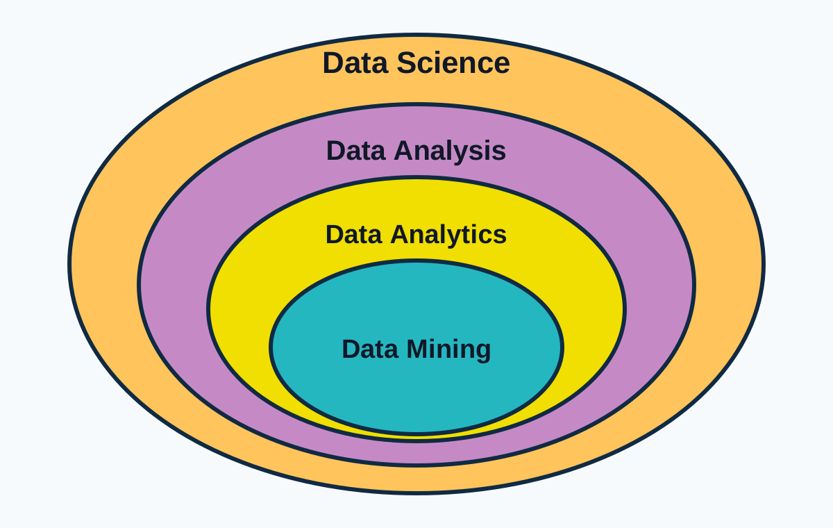
Classroom view of the relationship
This static teaching visual reinforces a simple beginner model: data science is shown as the broadest area, while data mining is the most specialized inner activity. It is easy to remember, but it should be treated as a teaching aid rather than an absolute rule for every organization.
In this lesson, the interactive model below helps refine that idea by showing both a simplified nesting view and a more practical overlap view.
Simplified nesting model
This model is easy to remember: data science is the broad discipline, data analytics converts data into insight, data analysis is the focused act of examining a dataset, and data mining is a set of techniques for finding hidden patterns.
- Data analytics: the end-to-end process of defining objectives, preparing data, analyzing it, communicating results, and supporting decisions.
- Data analysis: the focused examination of available data using summaries, charts, statistical methods, and interpretation.
- Data science: a broader discipline that can include data engineering, experimentation, statistics, machine learning, AI, software development, and data products.
- Data mining: techniques for discovering non-obvious patterns, relationships, clusters, anomalies, and frequent itemsets in large datasets.
D2P3 framework
The four types of analytics
A useful progression is descriptive → diagnostic → predictive → prescriptive. The original notes call this D2P3: one D for descriptive, a second D for diagnostic, then predictive and prescriptive.

Another way to picture D2P3
This visual shows a common progression: descriptive and diagnostic analytics are often associated with reporting and past-focused analysis, while predictive and prescriptive analytics usually require more complexity and are often linked to data science and machine learning work.
The exact boundaries vary in practice, but the graphic is useful because it emphasizes two ideas at once: the shift from past to future, and the rise in analytical complexity as the questions become more advanced.
Descriptive
What happened?
Summarize past and current performance.
Diagnostic
Why did it happen?
Investigate causes and relationships.
Predictive
What is likely next?
Estimate future outcomes and risk.
Prescriptive
What should we do?
Compare actions and recommend a course.
Descriptive analytics
Summarizes historical or current data to explain what happened, how much, when, and where.
| Analytics generation | Included activities | Primary focus | Typical questions |
|---|---|---|---|
| Analytics 1.0 | Descriptive and diagnostic analytics | Visualization, reporting, and learning from the past | What happened? How many? When and where? Why did it happen? Where should we look? |
| Analytics 2.0 | Predictive analytics | Statistical and predictive modeling focused on the future | What pattern is present? What is likely to happen next? |
| Analytics 3.0 | Prescriptive analytics | Optimization, simulation, and decision recommendations | What is the best action? What if we try this instead of that? |
When analytics is involved
Analytics surrounds the analysis—not just the calculation
Analytics is involved whenever a person or organization uses data to answer a meaningful question and support an action. The work begins before the dataset is ready and continues after the chart or model is complete.
Define
Clarify the objective, decision, stakeholder, scope, and success measure.
Collect
Gather relevant data from databases, systems, files, sensors, surveys, or external sources.
Clean
Remove duplicates, correct errors, address missing data, standardize units, and validate quality.
Transform
Join, filter, aggregate, reshape, engineer variables, and organize data for analysis.
Analyze
Use visualization, statistics, regression, time series, data mining, or machine learning.
Share and act
Communicate the evidence, recommendation, uncertainty, and decision implications.
Monitor
Measure the result, learn from the action, detect drift, and improve the next decision.
1. Define the objective
State the business problem, the decision to be made, who will use the result, the unit of analysis, the time horizon, and how success will be measured. A vague question produces vague analytics.
Quality gate: Can the team write one precise question that the analysis must answer?
Pattern recognition
Common patterns identified in analytics
A dataset can reveal basic changes over time or complex relationships among many variables. Select a visual card to see what the pattern means, where it appears, and how analysts usually investigate it.
Trend analysis
A trend describes the general direction of a series of data points over time. It may be upward, downward, or approximately horizontal.
How analysts identify these patterns
Data visualization
Charts, scatter plots, time-series graphs, maps, and dashboards make trends and anomalies visible.
Statistical analysis
Averages, variation, confidence intervals, hypothesis tests, correlation, and regression quantify patterns.
Machine learning
Algorithms learn from data to classify, predict, rank, detect anomalies, or create clusters.
Data mining
Pattern-discovery techniques sift through large datasets to uncover hidden relationships and frequent combinations.
Worked example
From rising defects to an operational decision
A manufacturing line has produced roughly 1,000 units each week. Defects appear to be rising, and supervisors suspect that equipment downtime may be involved. We will use the same dataset to demonstrate all four analytics types.
| Week | Units produced | Defects | Downtime (hours) | Defect rate |
|---|---|---|---|---|
| 1 | 1,000 | 18 | 2.1 | 1.80% |
| 2 | 1,020 | 20 | 2.3 | 1.96% |
| 3 | 980 | 19 | 2.0 | 1.94% |
| 4 | 1,050 | 23 | 2.5 | 2.19% |
| 5 | 990 | 28 | 3.0 | 2.83% |
| 6 | 1,010 | 34 | 4.2 | 3.37% |
| 7 | 1,030 | 40 | 5.0 | 3.88% |
| 8 | 970 | 44 | 5.4 | 4.54% |
Core calculations
| Symbol | Meaning | Unit | Use and limitation |
|---|---|---|---|
| a | Regression intercept | Percentage points | The fitted value when Week = 0; it may not have a direct practical meaning. |
| b | Estimated weekly change in defect rate | Percentage points per week | Use for a short-range linear trend only; do not extrapolate far beyond the data. |
| r | Pearson correlation between downtime and defect rate | Dimensionless, from −1 to +1 | Measures linear association. It does not prove that downtime causes defects. |
Interactive demonstration
Factory analytics lab
Edit the data, run the analysis, and watch the descriptive, diagnostic, predictive, and prescriptive outputs update together. This demonstrates why analytics is an integrated workflow rather than a single chart.
| Week | Units produced | Defects | Downtime (hours) | Calculated defect rate |
|---|
Descriptive: What happened?
Run the analysis to summarize the trend.
Diagnostic: Why might it have happened?
Run the analysis to examine the relationship with downtime.
Predictive: What may happen next?
Run the analysis to estimate Week 9.
Prescriptive: What should we do?
Run the analysis to generate a cautious action recommendation.
Interpretation guide
When you see this, it means this
| When you see this | It means this | What to do next |
|---|---|---|
| A sustained upward or downward trend | The process or behavior may be changing over time. | Check the time scale, data quality, context, and whether the change is statistically or practically meaningful. |
| A repeating pattern at fixed intervals | Seasonality may be present. | Compare equivalent periods and include seasonal terms in forecasting. |
| A strong positive or negative correlation | Two variables move together linearly. | Investigate mechanism, confounders, and time order before making causal claims. |
| Distinct groups of similar records | Clusters or segments may exist. | Profile the groups and test whether they are stable, useful, and actionable. |
| A point far from the rest | It may be an error, rare event, fraud, failure, or important special case. | Verify the record before deleting it; investigate the operational story. |
| Items repeatedly appearing together | An association or frequent itemset may exist. | Measure support, confidence, and lift; avoid confusing co-occurrence with causation. |
Common mistakes and exam traps
Where beginners go wrong
Comparing defect counts instead of defect rates
Why wrong: Counts can rise simply because more units were produced. Avoid it: Normalize by the appropriate denominator.
Calling correlation causation
Why wrong: A relationship can be driven by coincidence or a third variable. Avoid it: Investigate mechanism and use experiments or causal methods where needed.
Extending a straight-line forecast indefinitely
Why wrong: Trends often change outside the observed range. Avoid it: Forecast only within a defensible horizon and include uncertainty.
Analyzing before cleaning
Why wrong: Duplicates, missing values, unit mismatches, and entry errors can create false patterns. Avoid it: Build a reproducible data-quality check before modeling.
Accepting the chart or model because software produced it
Why wrong: Software executes instructions; it does not confirm that the question, method, or assumptions are valid. Avoid it: Validate inputs and interpret in context.
Choosing predictive analytics for “why did this happen?”
Why wrong: Prediction estimates future outcomes; diagnosis investigates causes. Avoid it: Match the verb in the question to the analytics type.
Starting with every technical detail
Why wrong: Decision-makers may miss the message. Avoid it: Lead with the question, evidence, implication, uncertainty, and recommendation.
Forcing the data to support the expected story
Why wrong: Confirmation bias distorts decisions. Avoid it: Predefine criteria, test alternatives, document exclusions, and disclose limitations.
Software guidance
Analytics tools and where they fit
Tools support the analytics lifecycle; they do not replace it. Choose software based on the problem, data volume, required methods, collaboration needs, governance, and maintainability.
| Tool or platform | Where to begin | Best suited for | Common mistake |
|---|---|---|---|
| Microsoft Excel and Access | Excel: Data → Get Data; Insert → PivotTable; Data → Data Analysis. Access: Create queries and relational tables. | Small-to-medium datasets, business calculations, summaries, quick models, and reporting. | Using manual copy-and-paste steps that cannot be reproduced or audited. |
| Power BI and Tableau | Power BI: Home → Get data; Home → Transform data; build the model, measures, and visuals. Tableau: Connect → Data Source → Worksheet. | Interactive dashboards, business intelligence, monitoring, and communication. | Building attractive visuals without a clear decision question or sound data model. |
| Python and R | Python: pandas, NumPy, matplotlib, scikit-learn. R: tidyverse, ggplot2, tidymodels. | Reproducible analysis, automation, statistics, machine learning, and large or complex workflows. | Writing code that works once but lacks validation, documentation, tests, or version control. |
| Minitab | Graph menus for visualization; Stat menus for basic statistics, regression, time series, quality tools, and DOE. | Statistical analysis, quality engineering, process capability, control charts, regression, and designed experiments. | Reading only the p-value while ignoring assumptions, effect size, residuals, and practical meaning. |
| SQL databases and historians | Use SELECT, WHERE, JOIN, GROUP BY, and window functions; examples include SQL Server, PostgreSQL, and Wonderware historians. | Structured data stored in rows, columns, relational tables, and time-series systems. | Pulling the wrong grain, duplicating rows through joins, or failing to validate row counts. |
| MongoDB and other document stores | Query document collections and nested fields; define a consistent schema and indexes. | Unstructured or semi-structured data such as documents, event payloads, and variable records. | Treating “schema-flexible” as “no data governance required.” |
| Apache Spark, Hadoop, and distributed platforms | Use distributed storage and processing when data volume, velocity, or variety exceeds a single machine. | Big data processing, large-scale transformation, streaming, and distributed machine learning. | Using big-data technology for a problem that a simpler database or local tool could solve better. |
Practice activity
Classify the analytics questions
A retailer notices that holiday sales change sharply each year. Classify each question as descriptive, diagnostic, predictive, or prescriptive:
- How much did sales increase last December compared with the prior year?
- Why did online sales grow while in-store sales fell?
- What will weekly demand likely be during the next holiday period?
- How should inventory and staffing be allocated to maximize service and minimize cost?
- Descriptive: it summarizes what happened and how much.
- Diagnostic: it investigates why the channels behaved differently.
- Predictive: it forecasts future demand.
- Prescriptive: it recommends the best allocation of resources under objectives and constraints.
Reasoning rule: identify the decision verb—summarize, explain, predict, or recommend.
Mini quiz
Check your understanding
Final summary
The analytics mindset
- Analytics turns raw data into meaningful patterns, conclusions, decisions, and measurable action.
- The full workflow includes defining, collecting, cleaning, transforming, analyzing, sharing, acting, and monitoring.
- Descriptive asks what happened; diagnostic asks why; predictive asks what is likely next; prescriptive asks what should be done.
- Data analysis is a focused activity within the broader analytics process.
- Data science, analytics, analysis, and data mining overlap; the exact boundaries vary by organization.
- Common patterns include trends, seasonality, cycles, relationships, clusters, anomalies, and frequent itemsets.
- Good analysts let the evidence lead, avoid causal overclaims, disclose uncertainty, and communicate objectively.
- The best tool is the simplest tool that answers the decision question reliably and reproducibly.
Remember this
Question → Data → Pattern → Insight → Action → Learning
Suggested next lesson: Data Cleaning Fundamentals.